Hyper Coffee — Brand Identity Case Study
A complete brand identity project for Hyper Coffee, a vibrant and modern coffee shop based in Busia County, Kenya. The identity was designed to communicate quality, sustainability, and community, creating a recognizable and scalable brand for future growth.
The Challenge
Hyper Coffee needed a strong and distinctive brand identity that would stand out in a competitive coffee market while remaining flexible enough to scale across multiple locations. The challenge was to visually express quality, warmth, and sustainability while creating a brand system that works across packaging, signage, digital, and print applications.
Design Approach
- Modern and expressive logo system adaptable to multiple formats
- Warm, energetic color palette inspired by coffee culture
- Clear typography hierarchy for brand consistency
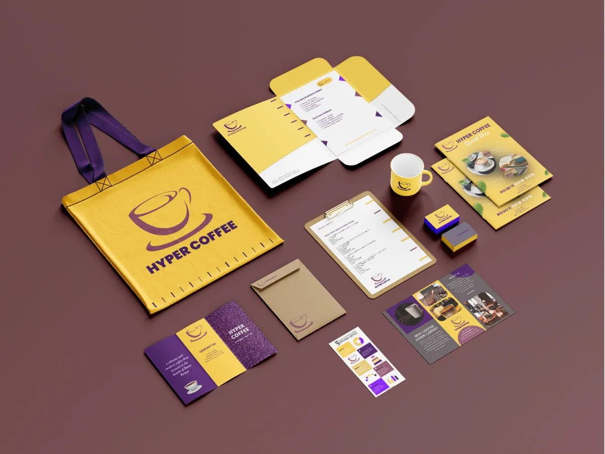
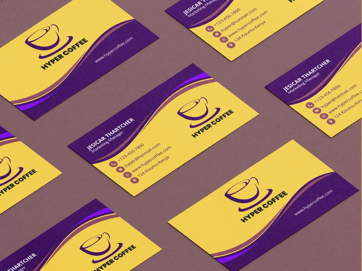
- Flexible visual assets for digital and physical touchpoints
- Brand guidelines to support long-term scalability
Typography System
A structured typographic hierarchy built using Poppins to ensure clarity, readability, and a modern brand presence across all Hyper Coffee materials.
Hyper Coffee Experience
Crafted for Community
Ethically Sourced Coffee
Hyper Coffee offers a welcoming environment where quality coffee, sustainability, and community come together in a modern setting.
Supporting text used for image captions and additional context.
Color Palette
Colors are one of the first things people notice about a brand. A consistent palette helps customers instantly recognize Hyper Coffee, even from a distance.
Sunglow
- HEX: #FFC94A
- RGB: 255 201 74
- CMYK: 0 21 71 0
Brings a cheerful and energetic vibe, perfect for a lively coffee shop atmosphere.
Royal Purple
- HEX: #430A5D
- RGB: 67 10 93
- CMYK: 28 89 0 64
Adds sophistication and luxury, appealing to customers seeking a premium experience.
Cannon Pink
- HEX: #874C62
- RGB: 135 76 98
- CMYK: 0 44 27 47
Introduces a playful and warm element, making the brand feel welcoming and friendly.
Falcon
- HEX: #795458
- RGB: 121 84 88
- CMYK: 0 31 27 53
Conveys strength and vision, reflecting quality and efficiency.
Selected Works
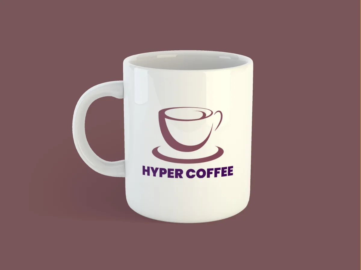
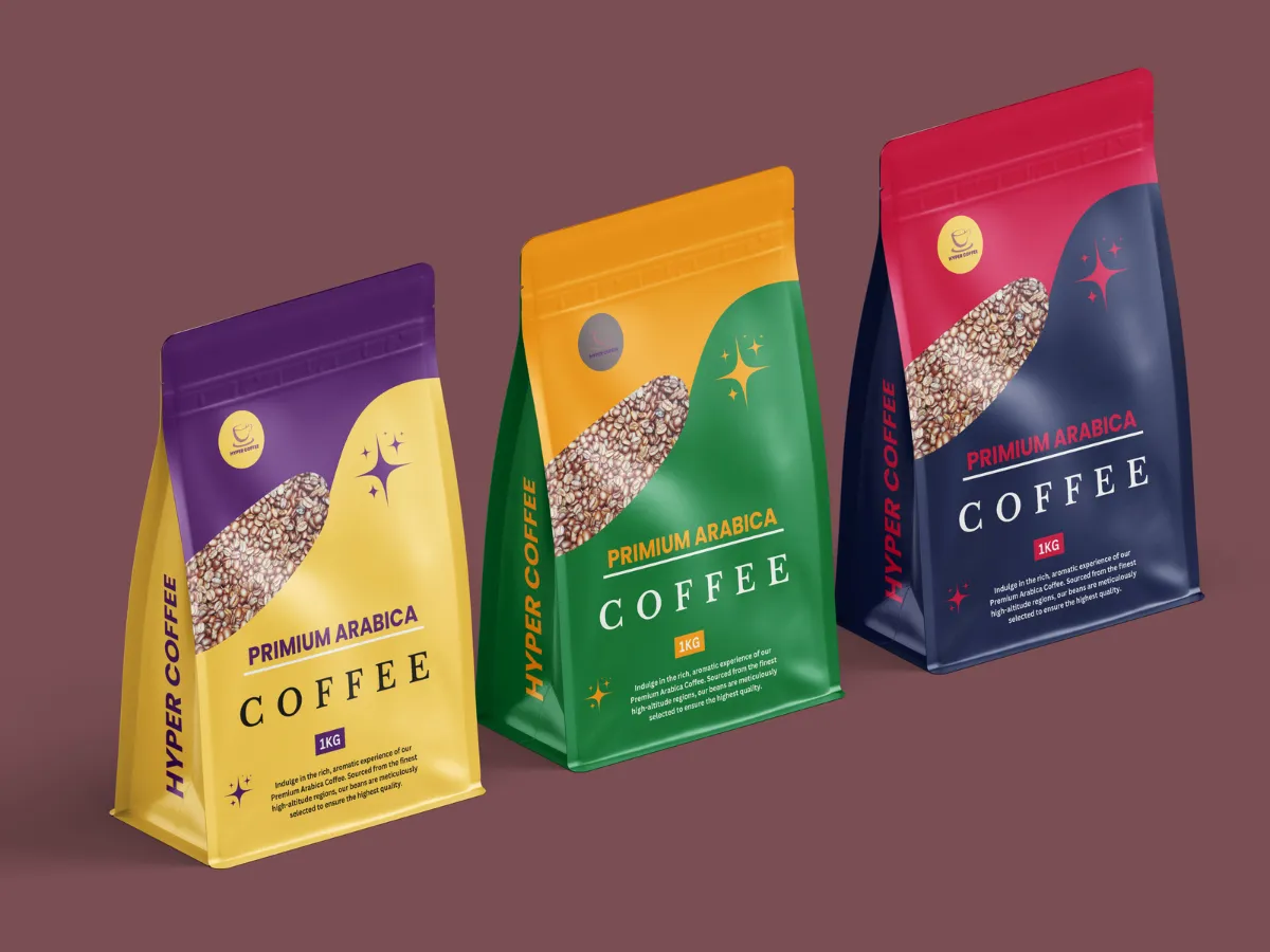
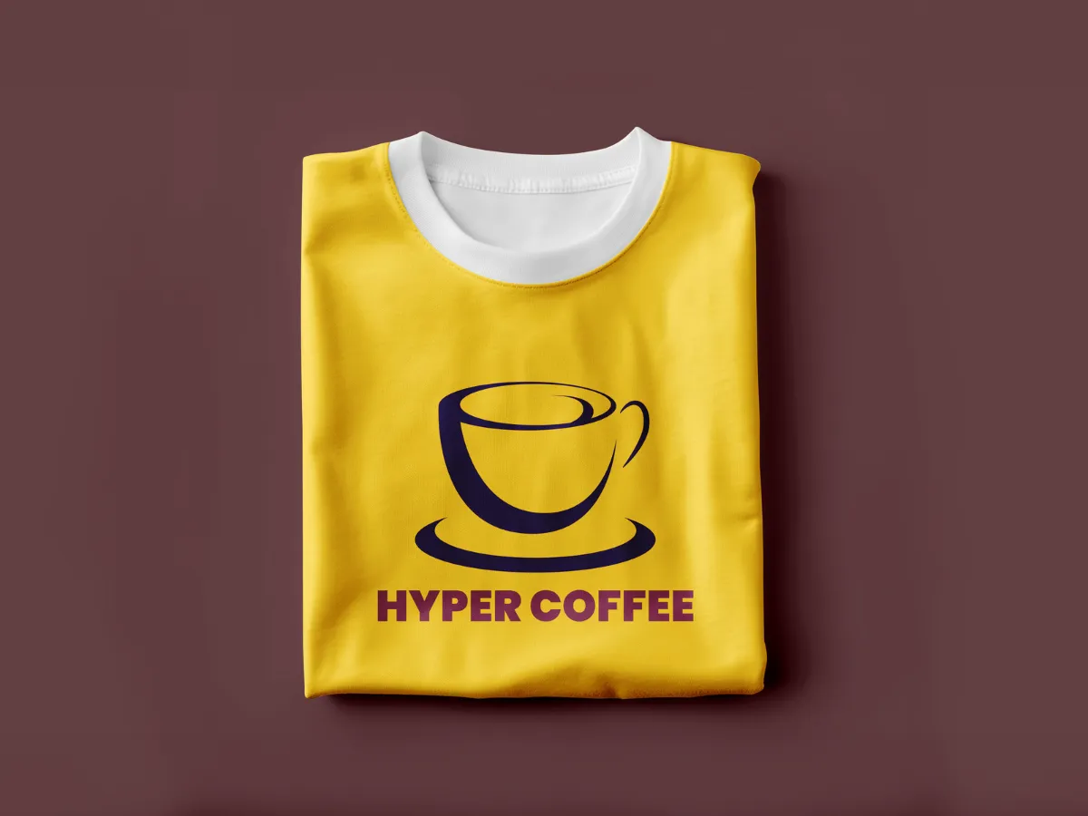
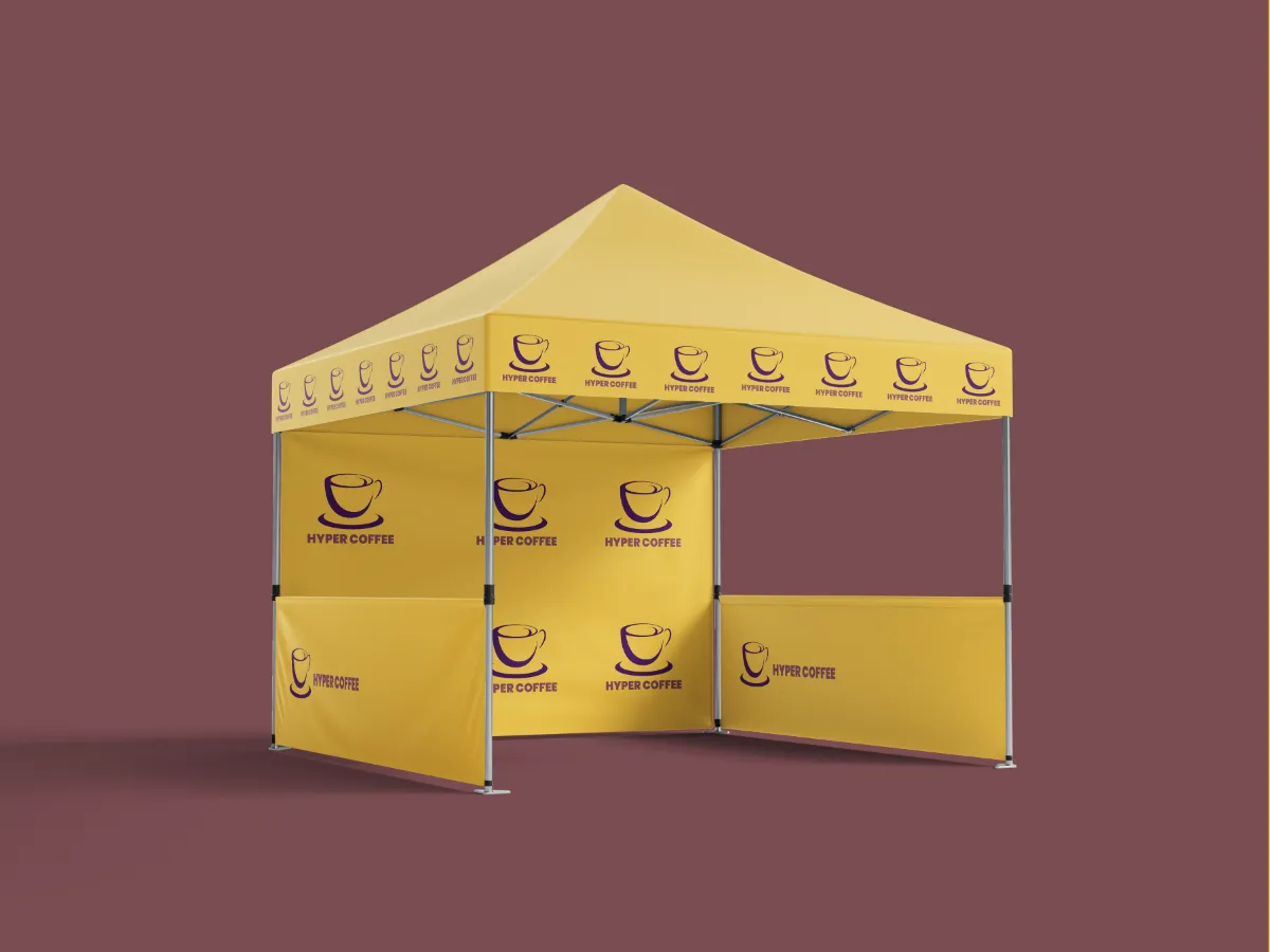
Outcome
The final brand identity positioned Hyper Coffee as a bold, welcoming, and community-focused coffee brand. The system provides consistency across all touchpoints while allowing flexibility for future growth, helping establish a strong foundation for expansion and brand recognition.