Personal Portfolio Website
A comprehensive digital portfolio showcasing my expertise as a Graphic Designer, Motion Creator, and Frontend Developer. This project demonstrates user-centered design principles, responsive web development, and engaging motion graphics.
Design Process
Wireframes, site map, and high-fidelity mockups created during the design phase.
Sitemap
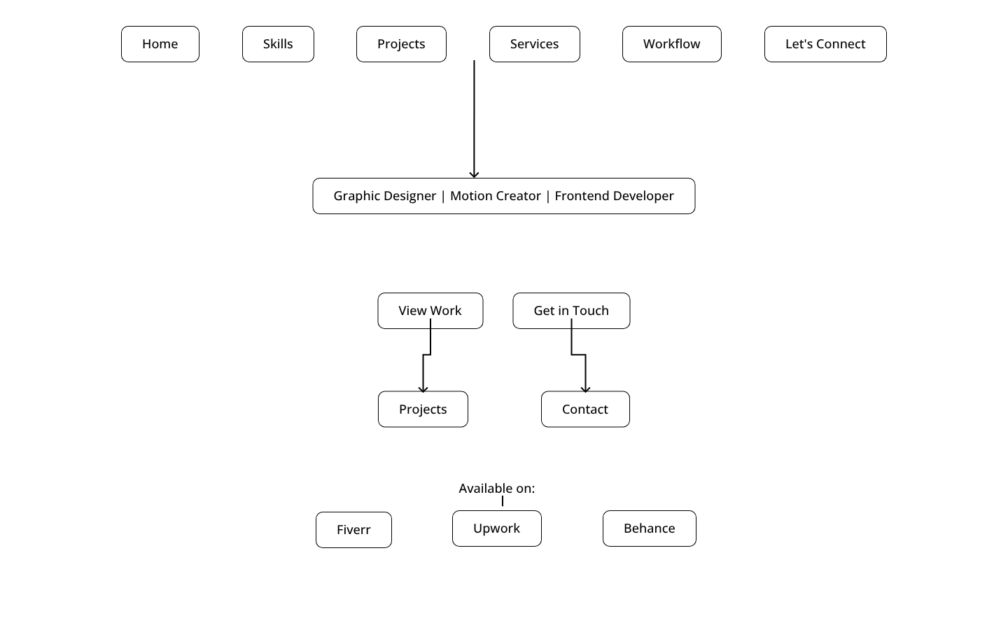
Wireframes & Prototypes
Interactive design exploration and user flow documentation created in Penpot.
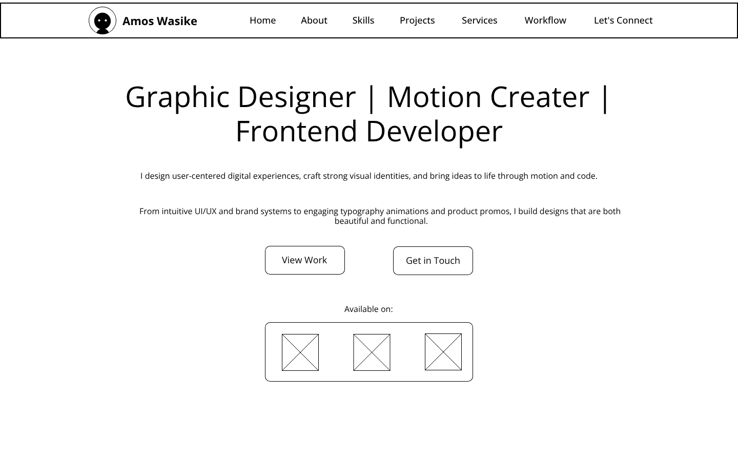
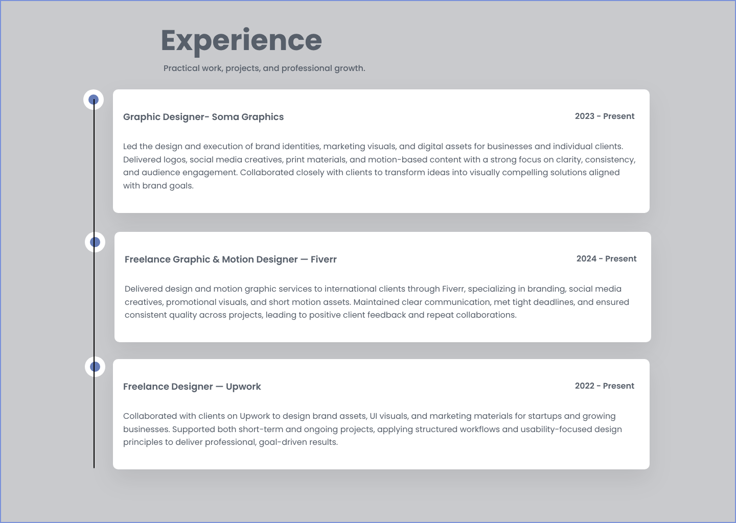
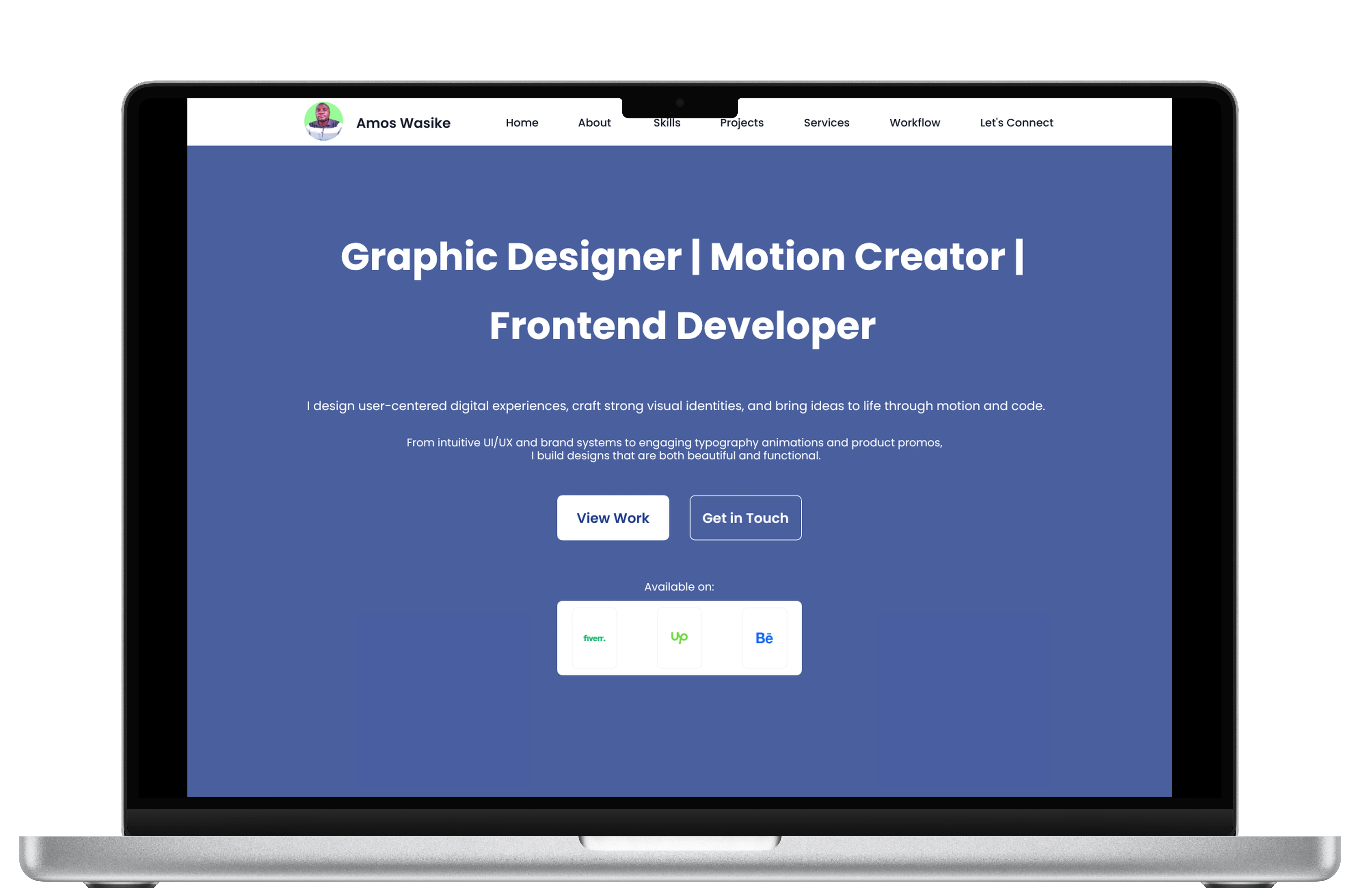
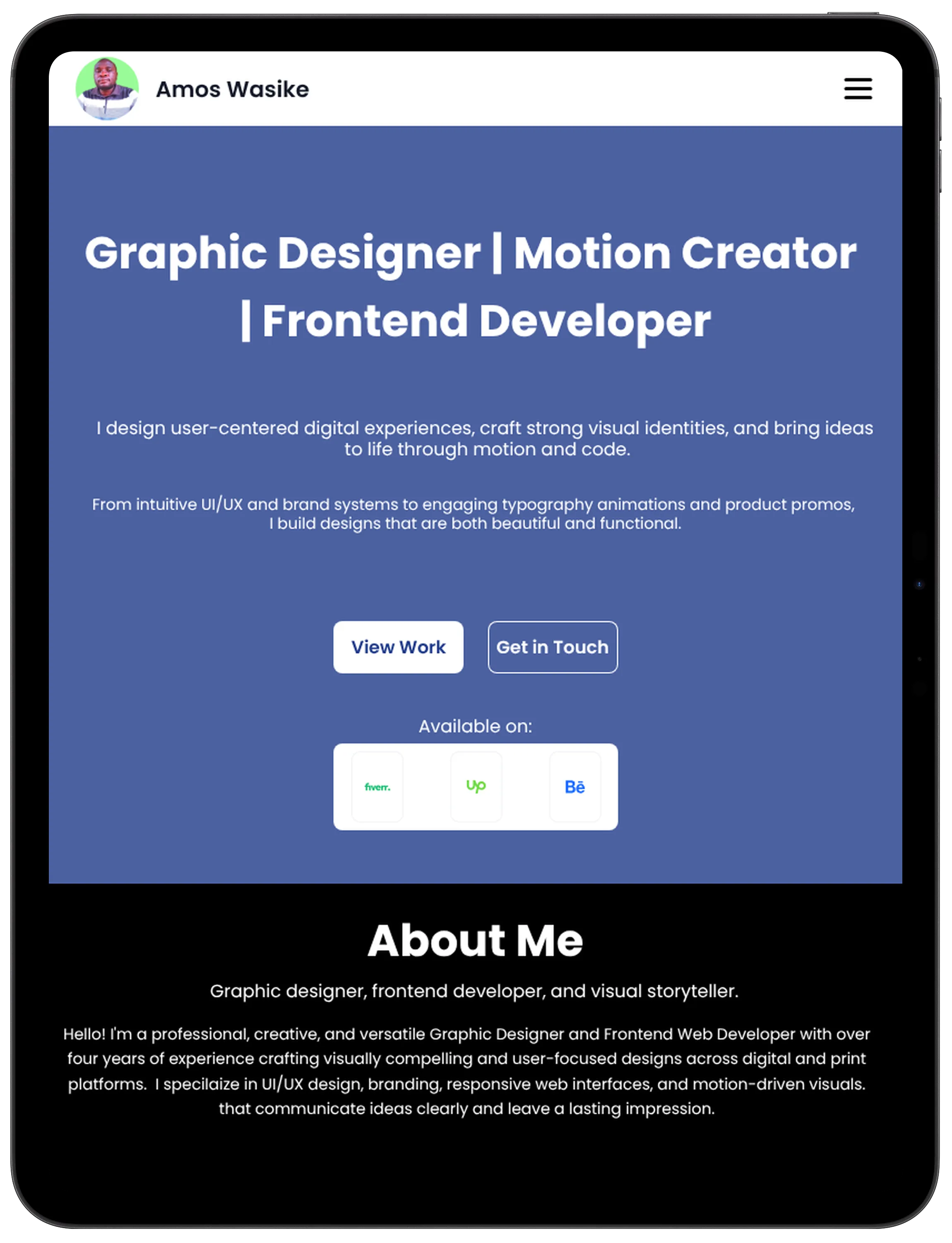
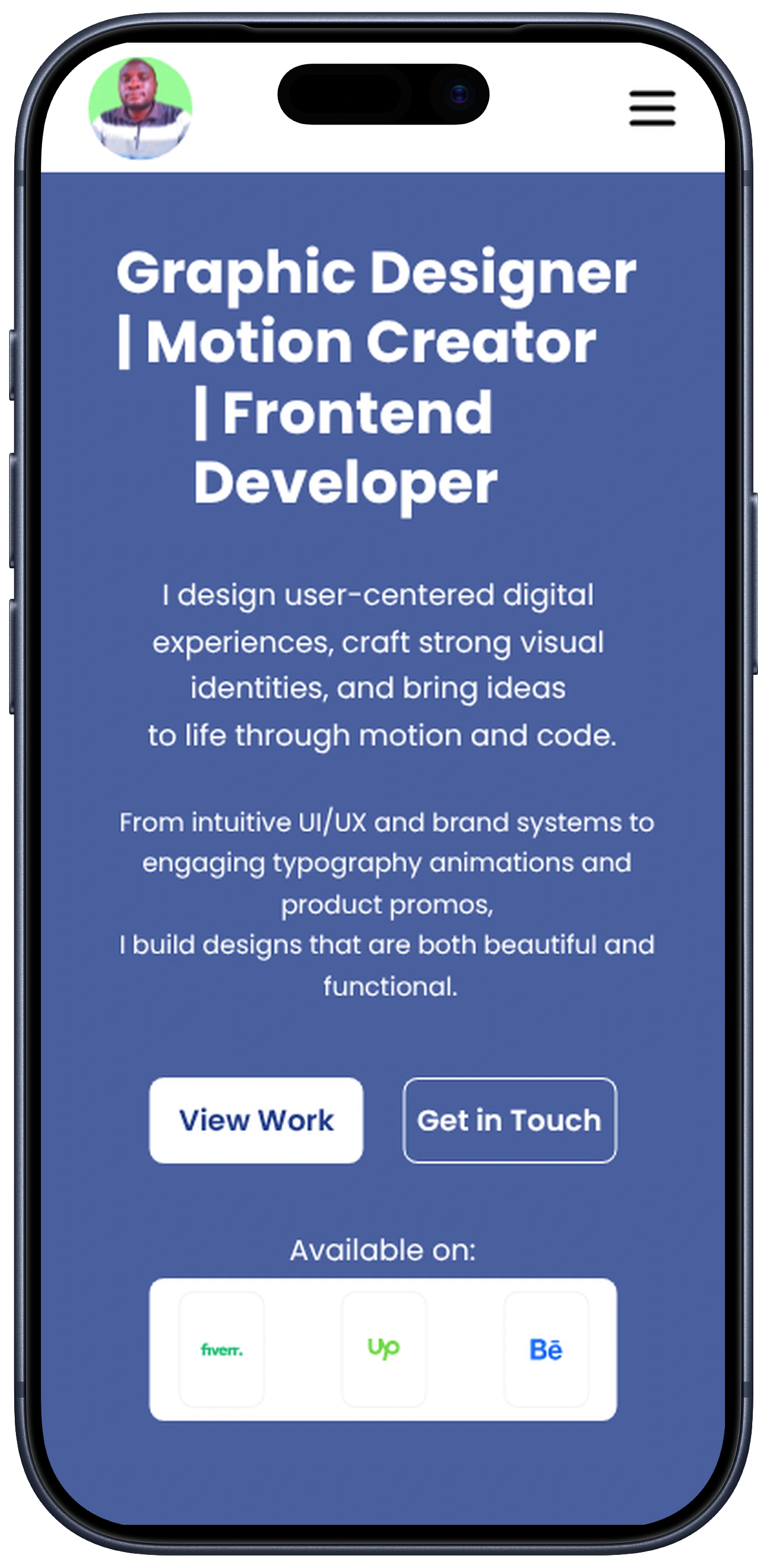
High-fidelity Mockups
Final mockups shown across desktop, tablet and mobile.
Project Overview
This personal portfolio website serves as both a professional showcase and a demonstration of my technical capabilities. Built with modern web standards and deployed on Netlify, it features a clean, responsive design that adapts seamlessly across all devices.
🎨 Design & Branding
Crafted a strong visual identity with consistent color schemes, typography, and brand elements that reflect my professional persona.
⚡ Motion & Animation
Implemented engaging scroll animations, hover effects, and interactive elements to bring the design to life and enhance user engagement.
💻 Frontend Development
Built with semantic HTML5, modern CSS3 including Flexbox and Grid, and vanilla JavaScript for optimal performance and accessibility.
📱 Responsive Design
Ensured a seamless experience across desktop, tablet, and mobile devices with mobile-first responsive design principles.
Technical Implementation
The website was developed using industry-standard practices and modern web technologies:
Frontend Technologies
- HTML5 - Semantic markup and accessibility
- CSS3 - Flexbox, Grid, animations, and responsive design
- JavaScript (ES6+) - Interactive features and DOM manipulation
Design Tools
- Adobe Illustrator - Icon design and vector graphics
- Adobe Photoshop - Image optimization and editing
- Figma - UI prototyping and design systems
- Penpot - UI prototyping and design systems
Development Workflow
- Git - Version control and collaboration
- Netlify - Continuous deployment and hosting
- VS Code - Code editing and development
Key Features
Interactive Certificates Modal
Dynamic modal system showcasing professional certifications with smooth animations and keyboard navigation.
Project Showcase
Detailed project pages with rich media, case studies, and professional presentation of design work.
Dark Mode Toggle
User-preference based theme switching with smooth transitions and local storage persistence.
Mobile Optimization
Fully responsive design with touch-friendly interactions and optimized performance on mobile devices.
Accessibility First
WCAG compliant design with proper ARIA labels, keyboard navigation, and screen reader support.
Performance Optimized
Fast loading times with optimized images, efficient CSS, and minimal JavaScript for optimal user experience.